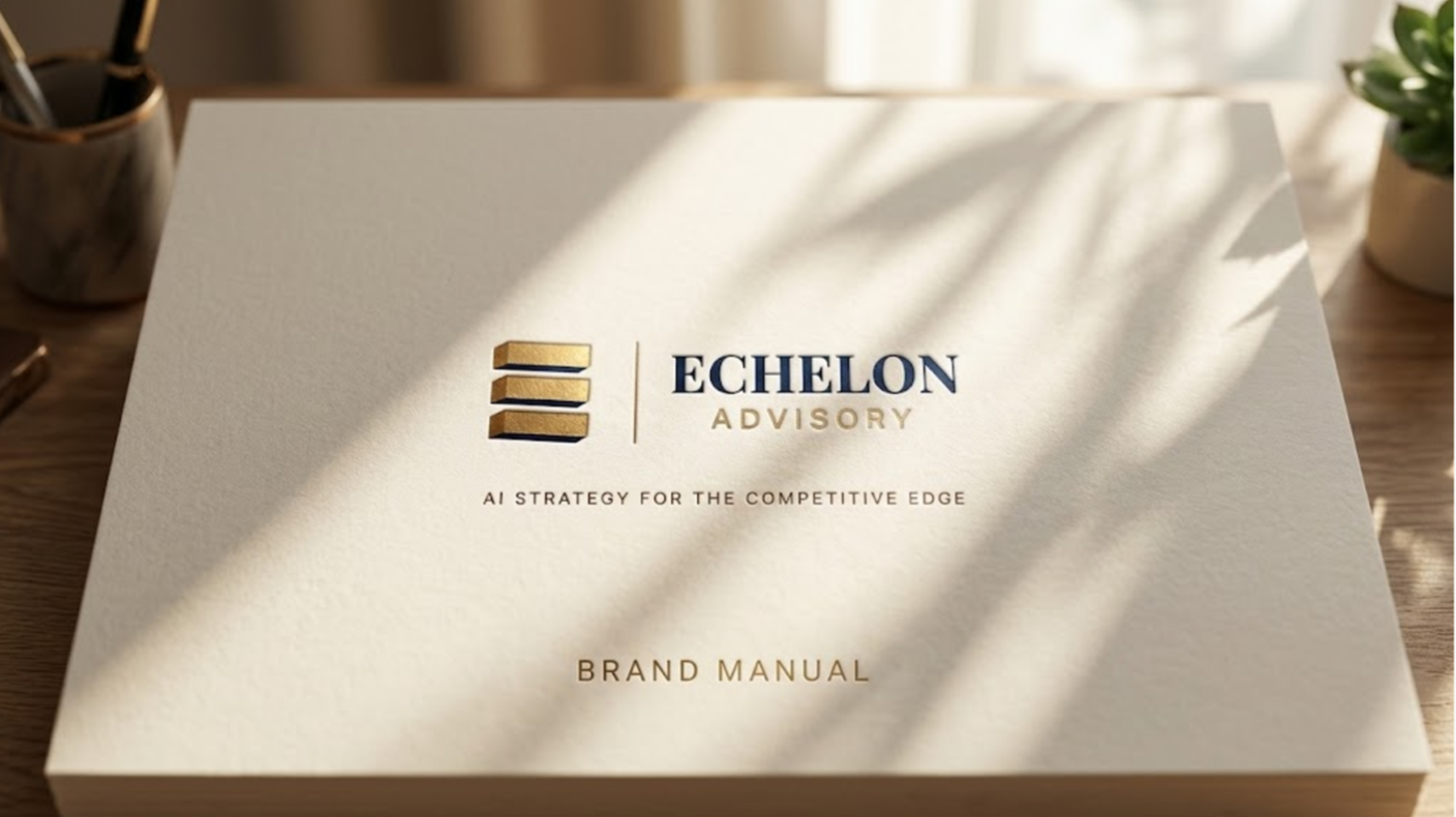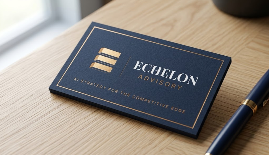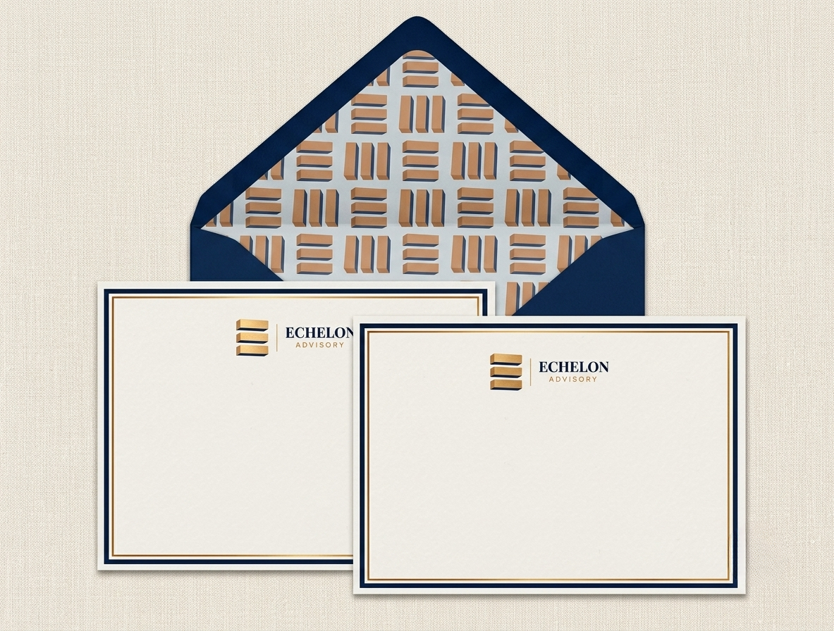
Echelon Advisory came to me with a color palette and a font pairing but needed those elements developed into a brand identity. The feeling they wanted to create was clear: authoritative, not intimidating; technical, yet accessible. From there, we built the rest of the identity together. I developed the logomark and wordmark, established how they'd look across lockups and applications, and translated the brand's voice into a full visual system spanning digital and print. From business cards and stationary to signage and client-facing deliverables. What started as a palette and a type pairing became a complete identity built to bridge AI consulting and strategy with the practical, human side of working with SMB clients.
Echelon Advisory
Brand Identity Logo Design Digital & Print Assets